


116 Cool CSS Text Effects Examples That You Can Download

You came here for some really cool CSS text effects that will help you make amazing web typography for your websites.
In order to successfully give a website a look that is more visually impressive, designers always concentrate on placing more emphasis upon typography that is both stylish and neat in nature.
These same designers used to depend upon programs such as Photoshop to accomplish this; however, since CSS3 was implemented and supported by most browsers, things changed a lot.
You should already be seeing advanced CSS font effects on various modern websites.
These kinds of effects are becoming very popular very quickly in terms of becoming a great trend in web design.
These can also be achieved with pure CSS, which is perhaps the greatest thing about these kinds of web typography effects.
CSS3 is considered to be a true revolution when it comes to web development. The new properties contained in CSS3 allow developers to visually enhance their designs in such a way that is not only impressive in a visual sense, but is also quick and easy.
Web typography is one major thing that has dramatically changed with CSS3. You can make your design look attractive with just a few simple CSS tricks.
When it comes to web design, CSS will help you to obtain many different font effects, including using such effects as animation and clipping to spice things up a bit.
To help further illustrate this, we’ve put together a list of effects that are visually stunning and beautiful, all of which are made possible through CSS, and some of them with a little bit of Javascript as well.
Table of contents
- Animated CSS text effects
- CSS Shadow text effects
- 3D CSS text effects
- CSS text background
- CSS hover text effects
- CSS glitch text effects
- Cool CSS text effects
CSS animated text effects
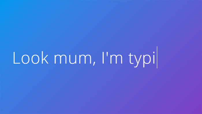
Text animation
See the Pen
Text animation by Yoann (@yoannhel)
on CodePen.
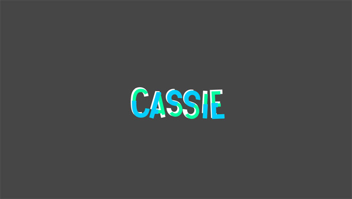
The second one of these CSS text effects is from Yoann Helin. He created in CSS this effect that you may have seen on a lot of portfolio and presentation websites.
Line text.
See the Pen
Line text. by Johan Fagerbeg (@birjolaxew)
on CodePen.
Animated text with HTML, CSS and JavaScript.
COSMOS
See the Pen
COSMOS by Patrick Brosset (@captainbrosset)
on CodePen.
While this CSS text effect isn’t the most useful one, it still is impressive.
Here’s what the author used:
- vw, vh, vmin units for responsiveness
- flexbox to center everything
- multiple box-shadows for the stars
- keyframes animation for the planets
- transform to rotate the planets
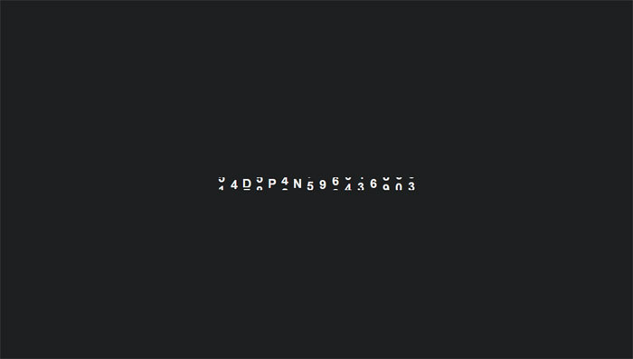
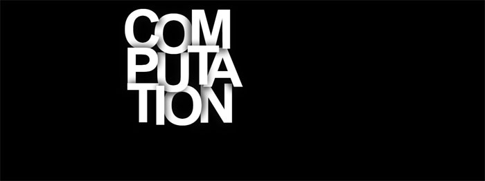
[webkit] Animated “text-shadow” pattern
See the Pen
[webkit] Animated “text-shadow” pattern by carpe numidium (@carpenumidium)
on CodePen.
Uses -webkit-background-clip: text & linear-gradient to simulate striped text shadow.
Animated signing of signature (SVG paths)
See the Pen
Animated signing of signature (SVG paths) by Gary Hepting (@ghepting)
on CodePen.
Use this pen to animate writing a signature with SVG stroke-dashoffset/stroke-dasharray and CSS transitions.
SVG Path animated Text
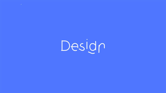
Animated the text “Design” based on one SVG path. Click to toggle animation.
Animated text fill with svg text practice
Animated text fill with HTML(Pug), CSS(SCSS) and SVG.
Animated text with Snapsvg
Work with this feels like an old good Flash :)
Vertically rotating text css [FORK] w/ browser prefixes
Vertically rotating text with HTML and CSS.
Rotating text
HTML, CSS and JavaScript rotating text.
#Codevember 3D Quote Rotator
Using GreenSock and the SplitText plugin to create a 3D text effect.
Impossibly Tipsy
Interesting effect for text.
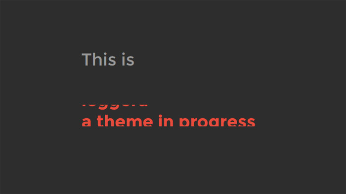
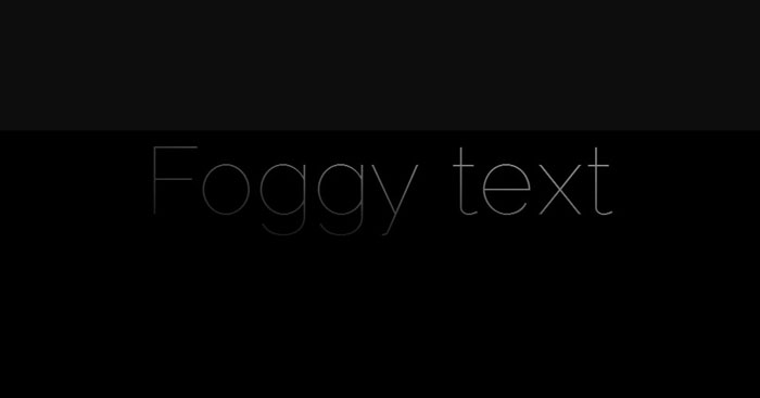
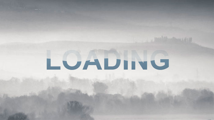
Foggy text effect
Cinematic intro text effect (Webkit only – text mask). This is experimental, but still had to include it among these CSS effects.
webdev series – Colorful text animation #updated
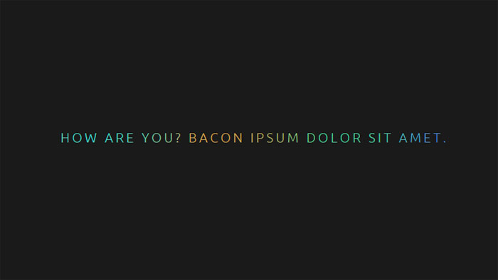
Fluid and configurable colorful text animation module made with SCSS.
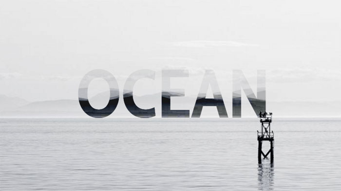
CSS Text filling with water
The next one of these CSS text effects is a text filling with water animation, for preloaders and such.
GSAP Text Animation
Text effect using Greensock.
Wave text effect (with SVG/blend mode)
Wave text effect with HTML and CSS.
Shattering Text Animation
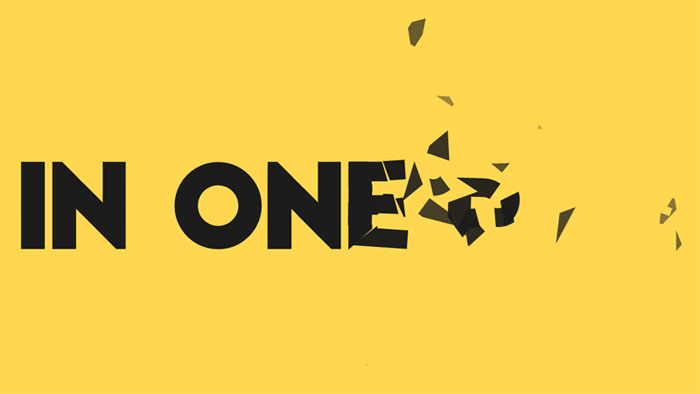
GSAP text animation. SVG path shattering. Slow motion on hover.
Squiggly Text
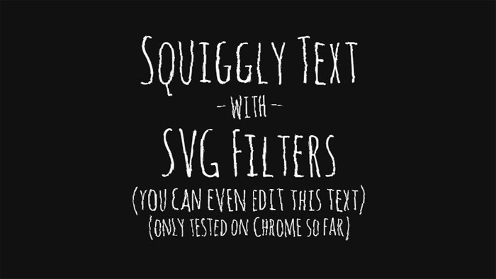
Squiggly text experiment with SVG filters.
Animated Headlines
A collection of animated headlines, with interchangeable words that replace one another through CSS transitions.
Text Animation: Montserrat
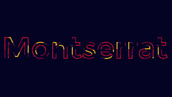
HTML and CSS text animation.
Shaded Text
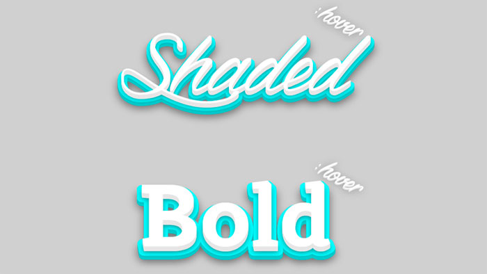
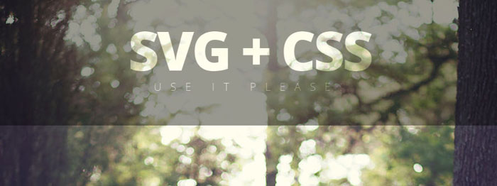
Shaded text, a SVG + CSS3 experiment about animated shadows. It isn’t optimized for mobile devices… yet.
Animating SVG text
HTML, CSS and SVG animating text.
text color draw

Path drawing of text using greensock’s drawSVG plugin.
Pure CSS Text Animation
HTML and CSS text animation.
Animated text fill
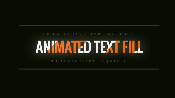
Fill your text with animated background images – no JavaScript required.
Bubbling Text Effect
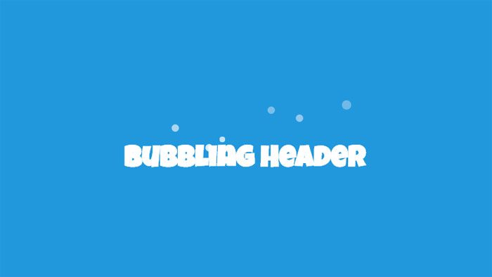
A jQuery powered example of how you can create a bubbling effect on a HTML heading. The bubbles appear as though they’re coming from behind the text, and then fade out and are removed.
Smoky Text
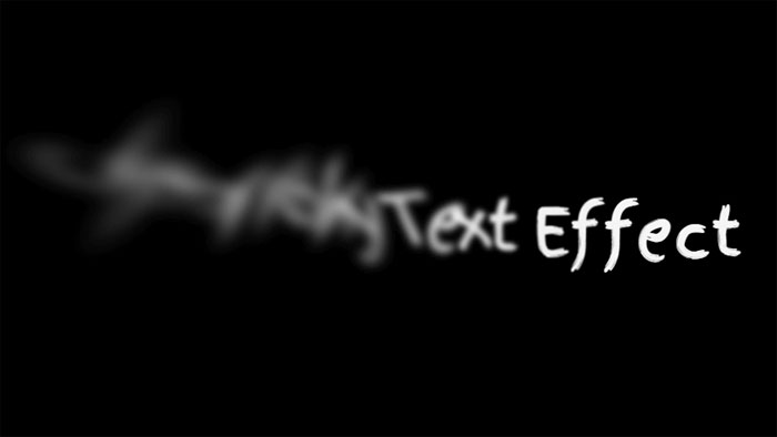
Combining text-shadow and CSS transforms (especially skew) for a smoky (or smokey?) effect.
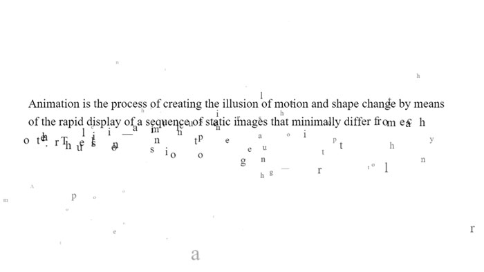
jquery break/animate warping text paragraph example
HTML, CSS and JavaScript break/animate warping text paragraph example.
Animated wave clipped by text
Animated wave inside text with svg. Image in the background and gradient filling the wave.
(cool) text effect
Animated text with GIF image.
Untitled
Animated text with HTML, CSS and JS.
Splitted text reveal
HTML, CSS and JavaScript splitted text reveal.
Onion Skinning Text Morphing
Onion skinning text morphing in HTML/CSS/JS.
Text-Shadow Animate
Text-Shadow animate with HTML and CSS.
SVG video mask on text
SVG video mask on text.
GSAP text reveal animation
GSAP text reveal animation.
SVG text animation
Nice SVG text animation.
CSS Only Random Text Transform (Animated)
Generate random text transformation using CSS only.
Silent Movie Text Effect
Movie text effect with canvas.
CSS TEXT REVEALING ANIMATION
Pure CSS text revealing animation.
Letter Animation
Animating letters with CSS.
Text Line Animation
Nice text line animation with TweenMax.js.
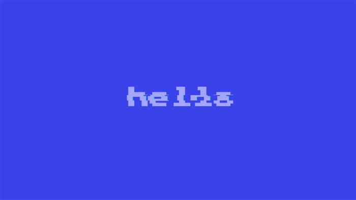
Helo!
Click to re-draw! Mapping sprites to text is always fun.
CSS only Frozen text
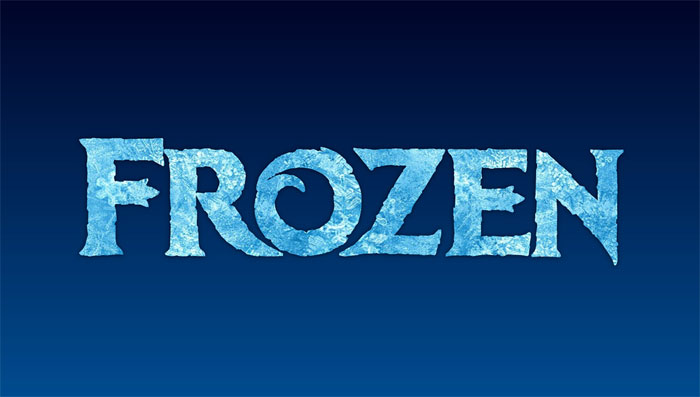
CSS only frozen text effect with background-clip, blend modes and gradient text.
letters effect
Letters effect on scroll.
Masking Path Animation
Sometimes simple is just as effective as complex.
Handwriting Animation (SVG + CSS)
SVG and CSS handwriting animation. In order to optimize the SVG for animation, the graphic was chopped up into smaller pieces. This was done primarily to prevent path elements from overlapping with unrelated clipPath elements, but also allowed finer control over the animation. All of the animated path elements were exported from Adobe Illustrator and fine-tuned with code.
Animated Text Gradient
Nice animated text with gradient.
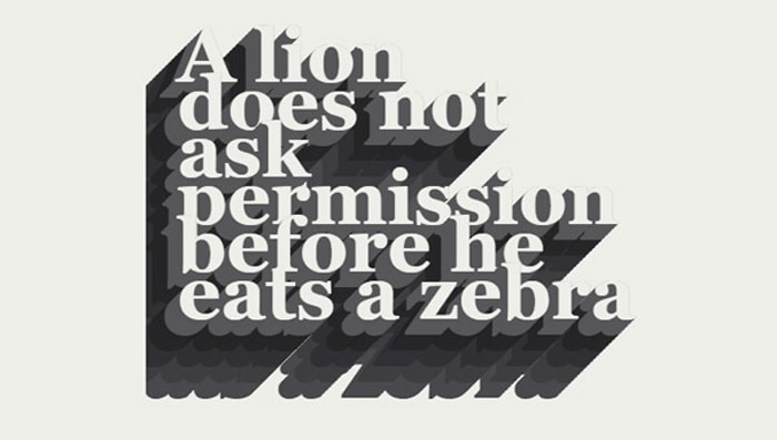
CSS Shadow text effects
CSS Dashed Shadow
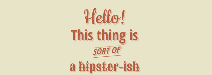
Pure css hipster-ish typographic dashed shadow.
Hit The Floor Text Effect
CSS3 text-shadow effects
HTML and CSS3 text-shadow effects.
Long Shadow Gradient Mixin
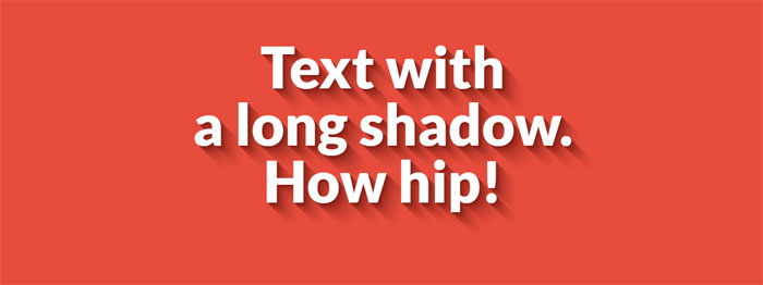
A Sass (Scss) Mixin to quickly generate long shadow gradients. Suitable for both ‘text-shadow’ and ‘box-shadow’.
CSS Text Shadow
Taking a stab at a Lynda.com tutorial. CSS: Advanced Typographic Techniques using lettering.js
Text-Shadow
HTML and CSS text-shadow.
Awesome Text-Shadow

Awesome text-shadow with CSS3.
Shadow Parallax • Reactjs
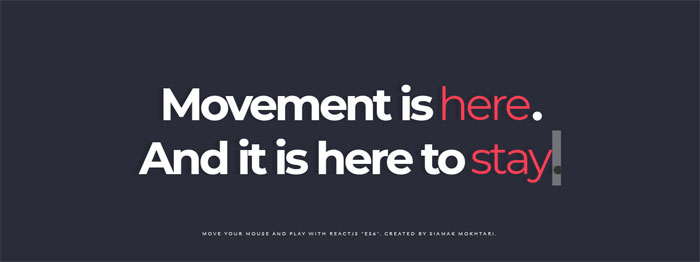
Move your Mouse and Play words. Written by React, ES6, Babel transpiler.
Neon text-shadow effect
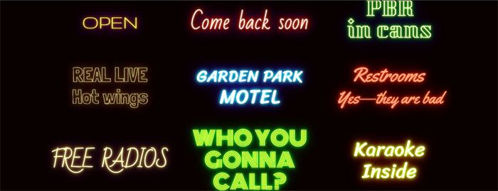
9 neon CSStext-shadow effects.
Styling Text with SVG (Second Shadow)

Styling text with SVG.
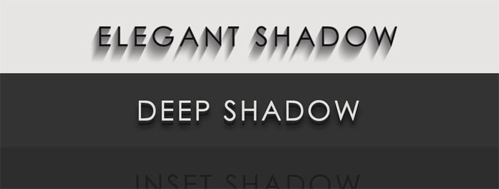
Pretty shadow

Pretty shadow with HTML and CSS.
Text-shadow

Pure CSS text shadow.
Fancy text shadow

Fancy text shadow.
Groovy CSS Effect

1960’s font effect using CSS text-shadow property along with SASS function and mixins to keep code DRY.
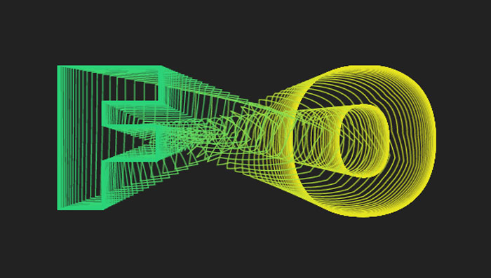
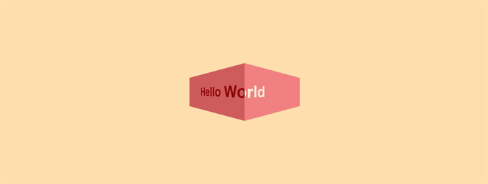
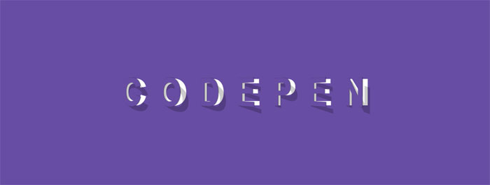
3D CSS text effects
3d Text effect – mousemove
See the Pen
3d Text effect – mousemove by Dennis Garrn (@dennisgarrn)
on CodePen.
Nice 3D Text effect with jQuery mousemove.
3D extrude text effect- CSS only
HTML and CSS 3D extrude text effect.
CSS Text Stroke | CSS Text Border – Infinite effect only with #CSS #html5
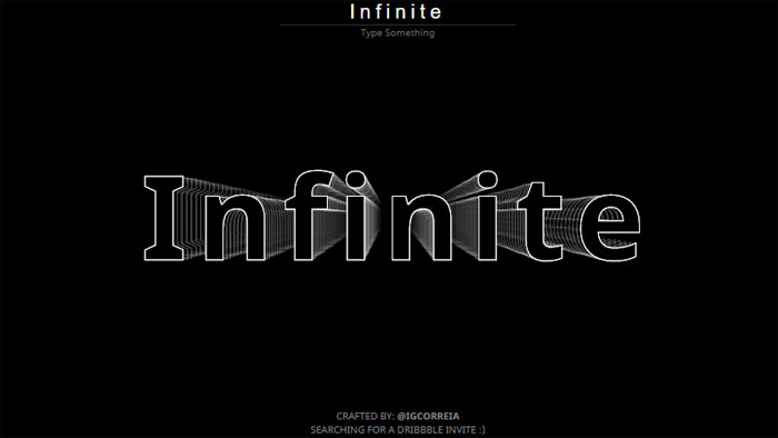
Change the text to see the animation again.
3D CSS Typography
See the Pen
3D CSS Typography by Noah Blon (@noahblon)
on CodePen.
Single element, multi coloured 3d text effect
Single element with multi coloured text and 3D text shadow effects. Just playing around with different CSS properties to create fun text effects.
Only SS: Text Wave
See the Pen
Only CSS: Text Wave by Yusuke Nakaya (@YusukeNakaya)
on CodePen.
Only CSS text wave.
Skewed and Rotated Text
Text with CSS skew() and rotate().
3d text marquee effects
3D text marquee effects.
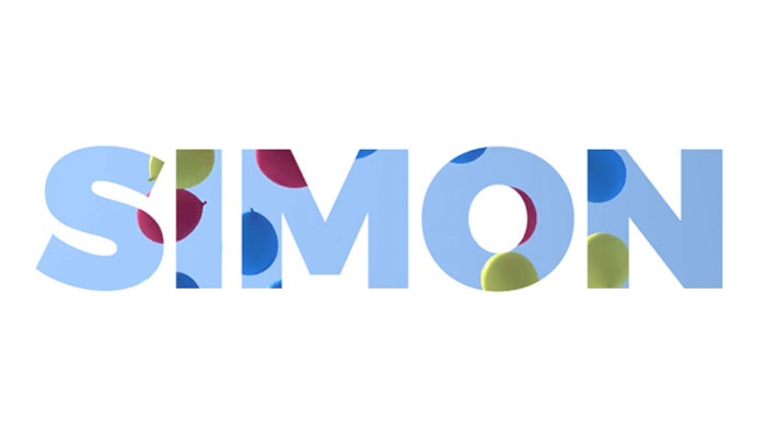
CSS text background
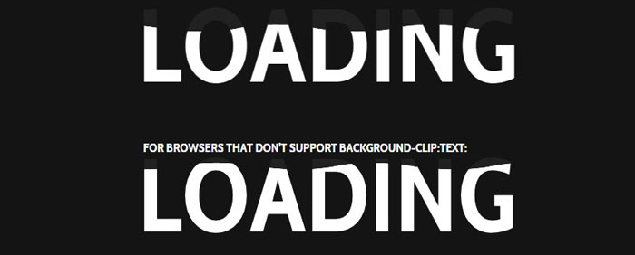
-webkit-background-clip:text CSS effect
Use -webkit-background-clip: text and -webkit-fill-text-color : transparent to apply a background to a text on webkit browser.
Set a color fallback for other browser.
Background clipping
Text background clipping.
SVG Knockout Text with Video Background
This demo explores creating knockout text/paths in SVG and looping a YouTube video as the fill.
SVG text mask
Gooey text background with SVG filters
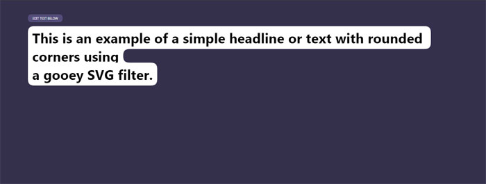
Example of using a gooey SVG filter to create smooth edges around inline text with a background.
Moving Cloud Text | HTML + CSS
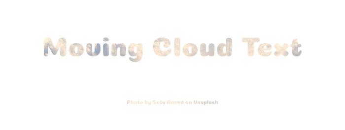
Moving cloud text with HTML and CSS.
CSS Attempts at text with inline skewed background
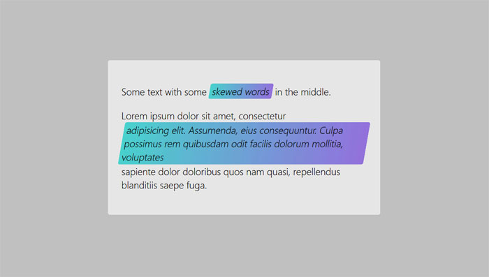
Using skew is only rendered if the item is display: block or inline-block. Some of these look the same on a wide viewport but fail differently as the viewport width is decreased.
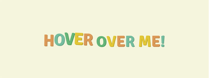
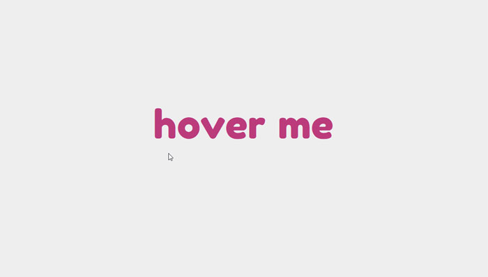
CSS hover text effects
Opening type
See the Pen
Opening type by Diego Pardo (@diegopardo)
on CodePen.
Efek Typography Text Neon part 1
See the Pen
Efek Typography Text Neon part 1 by Prima Utama Apriansyah (@primaapriansyah)
on CodePen.
Text design (typography) with neon effect.
Text-mask background moving on MouseMove – v2

Trying the new feature “background-clip: text”, with background moving.
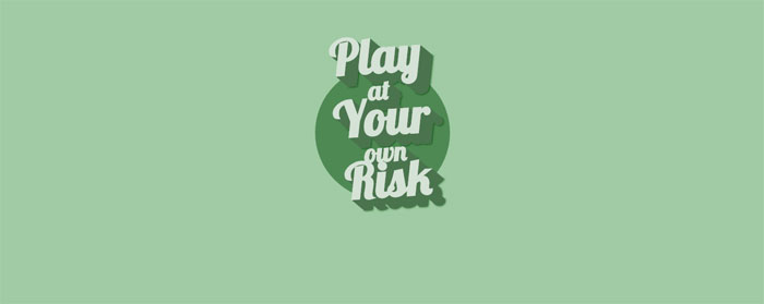
Peeled Text Transforms
This pen shows text that looks like it is peeled of the page. It has a smooth animation when hovered.
Happy Text
HTML and CSS happy text effect.
Animated highlighted text
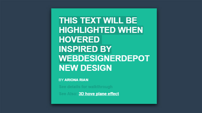
The idea is simple, it make used of linear gradient and transition.
CSS Perspective Text Hover
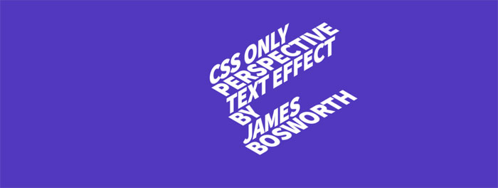
An experiment using webfonts in combination with CSS 3D transform tools.
Focus Text Hover Effect | HTML+ CSS + jQuery
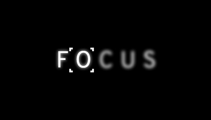
Hover CSS effect for text.
Animated underlines
Demo of an animated underline effect. Pure CSS animation.
How do I get a custom colored underline that will span multiple lines?
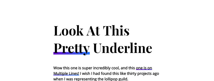
Pretty underline hover effect.
Simple CSS Hover Effect using Sass Loops
Simple little hover animation. Sass loops make staggering animation delays really easy to do…you can get a lot of mileage out of them.
Spring Text Hover Effect

Just playing around with effects for buttons and thought this was pretty cool.
Blended text layers
Content generated with JS.
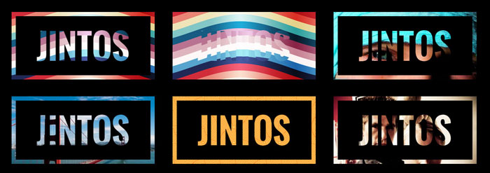
CSS glitch text
CSS glitched text by skew
HTML and CSS glitched text by skew.
CSS-Only Glitch Effect
Glitch sort of effect with CSS animation.
Glitch
Glitch text with HTML and CSS.
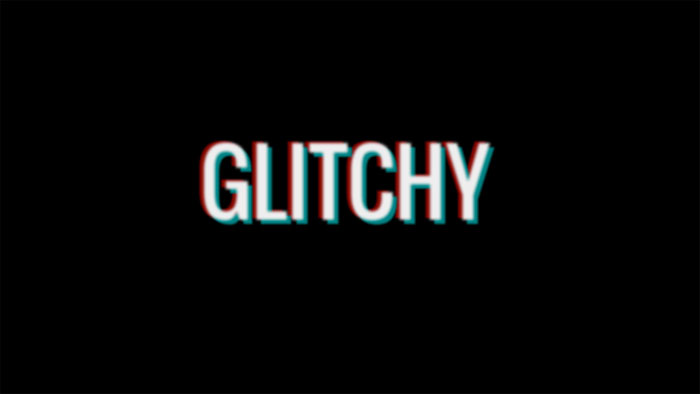
Glitchy Text
Glitchy text with HTML and CSS(SCSS).
Glitch Text
HTML(Pug) and CSS(SCSS) glitch text.
Glitched Text (study of The Verge)
HTML, CSS and JavaScript glitched text.
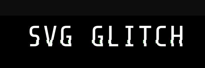
SVG Glitch
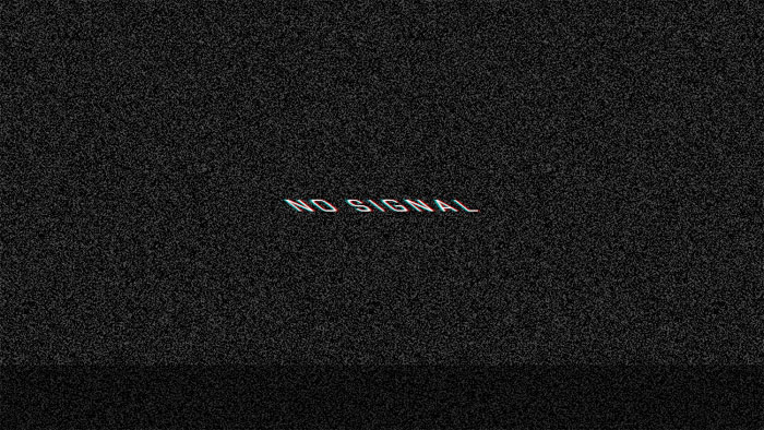
VHS text
VHS text with HTML, CSS and JavaScript.
Psycho Glitch (CSS variables & @keyframes)
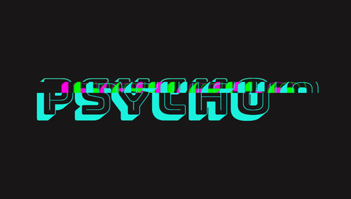
The “glitch” effect, recreated with animated CSS custom properties. Pure CSS.
Simple text glitch
Pure CSS simple text glitch.
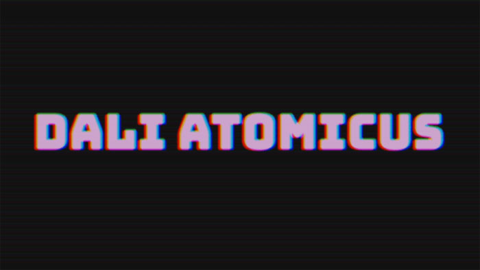
Cool CSS text effects
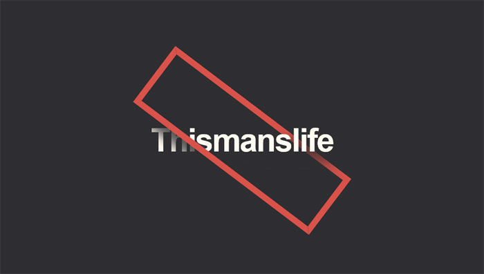
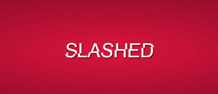
Slashed CSS Effect
Elastic stroke CSS + SVG
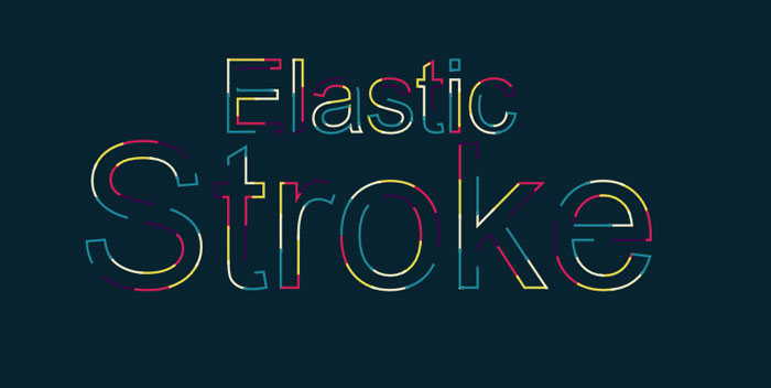
The first one of these cool CSS text effects comes from Yoksel. She chose an amazing color scheme for this beautiful CSS text animation.
SVG Text: Animated Typing
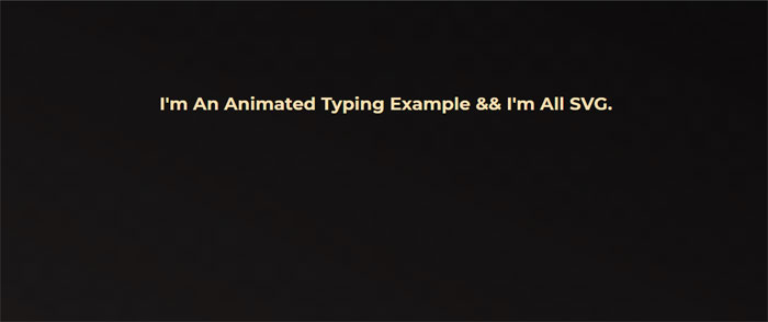
HTML, CSS and SVG animated typing.
Text typing thingamy
HTML, CSS and JavaScript text typing thingamy.
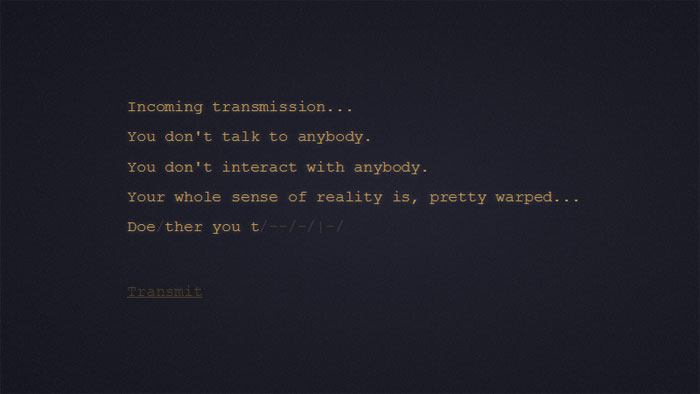
Futuristic Resolving/Typing Text Effect feat. GLaDOS
Futuristic resolving/typing text effect usually found in game or movie cut scenes to reveal text on screen.
Transmission: Glowing Text Animation
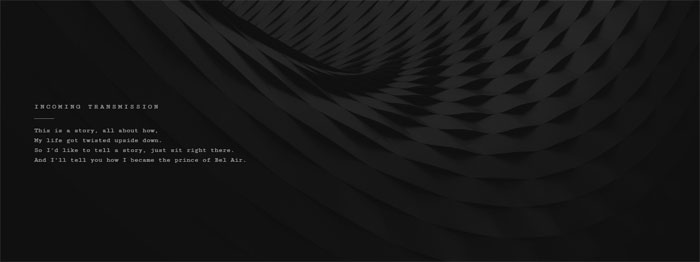
A little glowing text animation. First, some JS to wrap each letter in a span. Then a keyframe animation, with animation-delay mixin, lights up each letter in succession.
Text Scramble Effect
A little text decoding/scramble effect.
Kinetic Type with Greensock
Kinetic Type with HTML, CSS and JavaScript (Greensock).
LOVE Text Effect
Scrambled text effect inspired by the award winning Science Fiction film “LOVE”.
Auto Typing Text (function)
Auto typing text with HTML, CSS and JavaScript.
Typing Text
HTML, CSS and JavaScript typed text.
Typing Effect
Typing effect for text made with a simple JQuery function. Simply call the function with the element you wish to animate as the first argument and the animation speed as the second argument.
FAQ about CSS text effects
How can I create text shadows in CSS?
Oh, absolutely! Text shadows are a cool way to spice up your text. Just use the text-shadow property. You can set horizontal and vertical offsets, blur radius, and color like this:
text-shadow: 2px 2px 4px #000;
You can even add multiple shadows, just separate them with commas. Experiment with it and make your text pop!
What’s the trick for animating text?
Animating text is fun, and CSS makes it easy with keyframes and the animation property. First, define your keyframes with @keyframes like this:
@keyframes fadeInOut {
0%, 100% { opacity: 0; }
50% { opacity: 1; }
}
Then, apply the animation to your text element:
animation: fadeInOut 3s infinite;
Go ahead, give it a whirl and create some awesome animations!
How can I change the text color on hover?
You got it! Changing the text color on hover is a common effect to improve user experience. Use the :hover pseudo-class and the color property like this:
.element:hover {
color: #f00;
}
This will change the text color when the user hovers over the element. Pretty neat, huh?
How do I create a gradient text effect?
Gradient text? Sure thing! To create a gradient effect on your text, you’ll need to use the background property with a linear or radial gradient and the background-clip property. Here’s an example:
.element {
background: linear-gradient(90deg, red, blue);
background-clip: text;
color: transparent;
}
Now, your text will have a sweet gradient!
Can I create 3D text effects in CSS?
Definitely! You can create 3D text effects with the transform property and a little creativity. Here’s an example to give your text a 3D look:
.element {
transform: perspective(500px) rotateX(30deg) rotateY(45deg);
color: #00f;
text-shadow: 1px 1px 2px rgba(0, 0, 0, 0.5);
}
Give it a shot, and you’ll see your text come to life!
How to make a typewriter effect?
A typewriter effect? Sure! You can create it using keyframes and the animation property. Check out this example:
@keyframes typing {
from { width: 0; }
to { width: 100%; }
}
.element {
animation: typing 4s steps(40, end);
overflow: hidden;
white-space: nowrap;
border-right: .15em solid;
}
Now, your text will appear like it’s being typed on a typewriter. Cool, huh?
How to create a neon glow effect?
A neon glow effect is awesome and easy to create! You don’t need to work in a web development agency to pull it off. Combine the text-shadow property with a bright color, and you’re good to go. Here’s an example:
.element {
color: #fff;
text-shadow: 0 0 5px #00ff00, 0 0 10px #00ff00, 0 0 20px #00ff00;
}
Now, you’ve got that vibrant neon glow on your text!
How do I create a marquee-like scrolling text?
To create a marquee-like scrolling effect, use keyframes and the animation property. Let me show you an example:
@keyframes scroll {
0% { transform: translateX(100%); }
100% { transform: translateX(-100%); }
}
.element {
display: inline-block;
white-space: nowrap;
animation: scroll 10s linear infinite;
}
This will make your text scroll horizontally, just like a marquee. Enjoy playing around with it!
Can I make text appear with a fade-in effect?
Absolutely! You can make your text fade in using keyframes and the animation property. Here’s a quick example:
@keyframes fadeIn {
0% { opacity: 0; }
100% { opacity: 1; }
}
.element {
animation: fadeIn 3s ease-in;
}
Now your text will fade in smoothly. Neat, right?
How do I create a text stroke effect?
Creating a text stroke effect is simple with the text-stroke property. However, be aware that it’s not fully supported in all browsers. Check out this example:
.element {
-webkit-text-stroke: 2px #000;
color: #fff;
}
This will give your text a white fill and a black stroke. Just remember, it might not work everywhere, but it’s still worth a try!
Ending thoughts on these CSS text effects
We’ve had quite the journey exploring the world of CSS text effects together in this article. I’ve gotta say, it’s been a blast! It’s honestly amazing how powerful CSS can be, right?
So, let’s wrap this up!
- We’ve discovered tons of cool CSS text effects, like glowing, animated, and even 3D text.
- We’ve seen the power of
@keyframesand how they can bring life to our text. - We’ve also learned how to combine different CSS properties to create unique and eye-catching effects.
Now, the ball’s in your court. It’s time to take all this knowledge and let your creativity run wild! Just remember:
- Experiment with different styles and combinations to make your text stand out.
- Play around with
@keyframesto bring motion to your text and make it more engaging. - Keep learning and staying up-to-date with the latest CSS techniques and trends.
As a 35-year-old, I’ve seen the web evolve, and trust me, it’s only gonna get better. Don’t be afraid to push the boundaries of what you can do with CSS text effects. Your website, blog, or project will thank you for it!
If you liked this article with CSS text effects, you should also check out these articles:
- CSS And Javascript Animation Libraries To Create Awesome Effects
- Some Of The Most Popular CSS Libraries That Are On Github
- Programming Fonts: The Top Choices for Developers
Bogdan Sandu, a seasoned designer with 15 years of diverse experience, has been designing websites since 2008.
Renowned for his expertise in logo design and visual branding, Bogdan has developed a multitude of logos for various clients.
His skills extend to creating posters, vector illustrations, business cards, and brochures. Additionally, Bogdan's UI kits were featured on marketplaces like Visual Hierarchy and UI8.
Latest posts by Bogdan Sandu (see all)
- The Epic Games Logo History, Colors, Font, And Meaning - 24 April 2024
- Spread Joy: Happy Color Palettes for Uplifting Designs - 24 April 2024
- The Konami Logo History, Colors, Font, And Meaning - 23 April 2024